I did another video tutorial recently on Joomla module positions, and I used the old trick of adding “?tp=1” to the end of the url to display the module positions.
If you’re unfamiliar with this, try browsing to your Joomla site and adding that to the end of the url. So if I had:
“http://www.example.com/”
I could just add that code to the end of it like so:
“http://www.example.com/?tp=1”
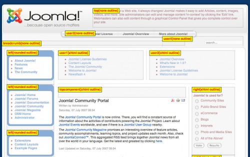
Once you do this all the module positions are displayed for you over the top of the existing site, like so:

This is pretty good, but you’ll notice that depending on the colors and style of your site, the module positions names may not be clearly visible, requiring you to squint or otherwise expend a lot of effort to figure out what’s going on.
I got tired of this so I decided to change the styling and make it something that was a little easier to read.
It turns out the module info css code is usually something like this:
.mod-preview-info {

background-color:white;

border:1px solid black;

color:red;

opacity:0.8;

padding:2px 4px;

position:absolute;

}
Notice the opacity rule there. That’s a big part of the problem, but not the whole problem.
I found that code by using the Firebug add-on in Firefox. Then you have to put your code into the css file of your site. Depending on your template, you may have different css files to play around with. Using the standard Rhuk_milkyway template, I just put my new code into the “template.css” file in the templates>rhuk_milkyway>css folder of the template.
I decided to change the previous code to this:
div.mod-preview-info {

background-color:yellow;

border:1px solid black;

font-weight: bold;

color:red;

opacity:1.0;

filter:alpha(opacity=100);

padding:2px 4px;

position:absolute;

z-index: 1000;

}
My changes are as follows:
1. I changed ‘mod-preview-info’ to ‘div.mod-preview-info’. Adding the ‘div’ to the rule makes it a bit more specific, and thus more likely that your style will win out over the default style.
2. Changed ‘background-color’ to yellow and ‘color’ to red for a more striking contrast.
3. Added ‘font-weight: bold’ to make it stand out even more.
4. Changed ‘opacity’ to 1, which is completely opaque, so there’s no transparency to add to the confusion.
5. Added ‘filter:alpha(opacity=100)’ because IE doesn’t understand the ‘opacity’ rule. Ironically, testing in IE and using the ‘?tp=1’ worked better because it didn’t make the div transparent. I just added this rule to be sure in case an update to IE comes out that changes something.
6. Finally, at the bottom, I added ‘z-index: 1000’ to bring everything to the top. I noticed that some of the module positions were still kind of ghosted, and I finally realized they were showing up under the modules, so adding that z-index lifts it all the way to the top of the stack.
So with that done when I use the module view trick I get this:

As you can see it’s much easier now to tell at a glance what module is at what position.
Hope this helps somebody with this admittedly minor but sometimes frustrating problem.


Hi,
Found your blog through Tia’s blog….I read your comment on her latest post and was curious to check your blog out! I think you have/had the same general idea that I have for my blog – which is to blog about the tricks and codes and such that I use and the problems I figure out in web design! We think alike! :)
Anyways, about this post – I just have to ask: do you like using Joomla? and why or why not? I really do not like Joomla, I avoid it at all costs! I have only done one website on Joomla actually, but it was so difficult to figure out and work with that I would be happy to never use Joomla again!
Have you ever used WordPress? that is my CMS of choice, I absolutely love it! At least for me, it is so easy to work with and edit and redesign and easy for clients to use to maintain their site when it’s done.
So, i am just wondering if you’ve used WordPress as well as Joomla and how you would compare the two?
For those wondering about this, Libby found my other post here:
https://www.hypertransitory.com/blog/2010/08/02/from-joomla-to-wordpress/
and commented on it. I think that one answered the questions! :)